
Call Us Today!
Call Us Today!

If you’ve ever tried to choose a gray paint then you know how tricky it can be. Nearly all grays have an undertone which adds depth and dimension, but it can also result in your gray paint looking different than you expected.
Our goal is to always make the painting experience as enjoyable as possible for our paint clients in Denver and beyond. So, today we’re breaking down the best Sherwin Williams Gray Colors.
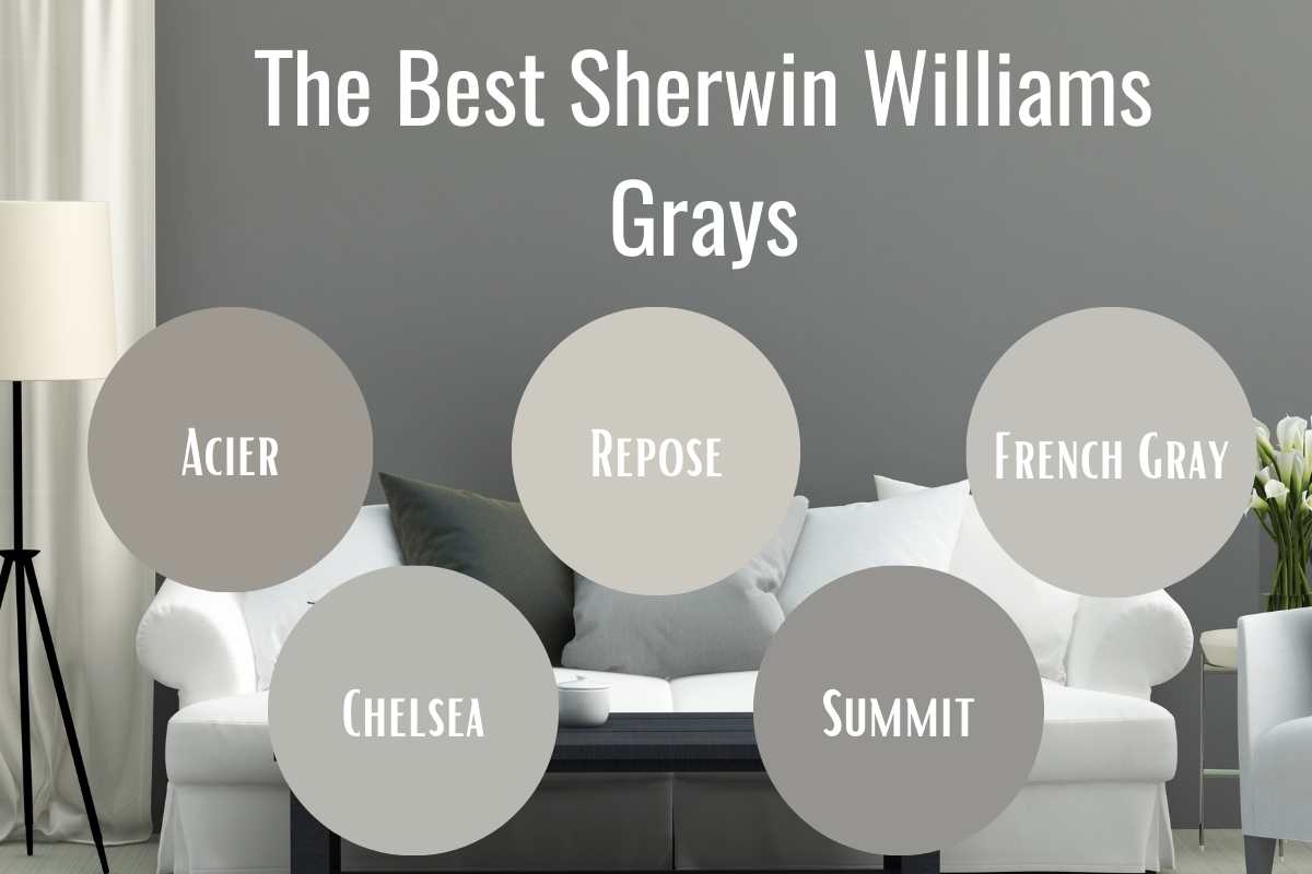
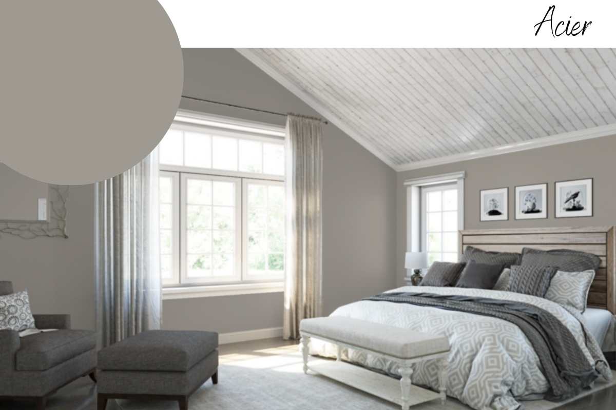
Acier SW 9170 from Sherwin Williams is a fantastic gray for both exteriors and interiors. We consider this a warm gray, because of its slightly red undertone. We often lean towards warm grays, because they’re rich, dynamic, and able to play off both cool and warm elements.
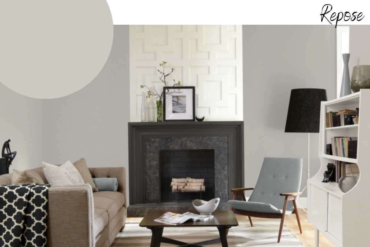
Repose Gray SW 7015 has been one of the most popular Sherwin Williams grays for years. You might look at this color and think, “that doesn’t feel like a gray.” And you are right! Repose Gray is a very warm gray. Its beige undertone could also make it considered a greige.
What’s great about Repose Gray is it can balance both warm and cool elements very well (much like Acier). However, it’s more of a true gray when compared to other popular greige colors like Agreeable Gray SW 7029.
 Agreeable Gray SW 7029 is a warm, versatile greige (gray + beige) with soft undertones that adapt to different lighting. It’s a popular neutral that complements both warm and cool color schemes, making it perfect for any room.
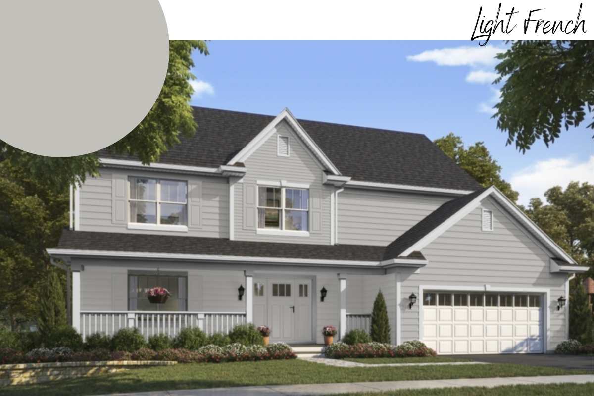
If you’re looking for a light and fairly neutral gray, then Light French Gray SW 0055 might be a great option for you. Light French Gray can be used on exteriors and interiors and it has a fairly balanced pigment mixture. It has a very slight warmth, which helps the color from feeling too flat and dull.
When it comes to searching for a “true” gray, they should not contain a blue or green undertone. For that reason, Light French Gray is a great “true” gray option.
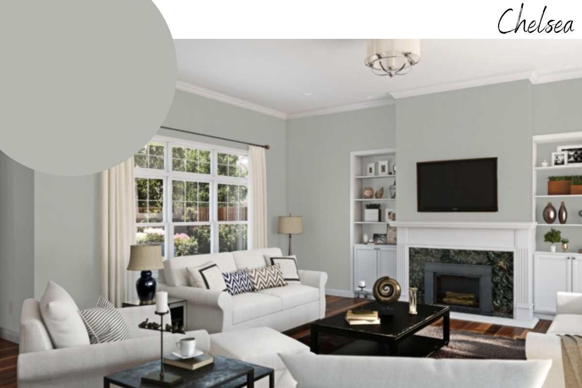
Not to be confused with Benjamin Moore’s Chelsea Gray, Sherwin Williams’ Chelsea Gray SW 2850 is a great option for both exteriors and interiors. This is the coolest toned gray on our list, but overall it’s still fairly neutral with a slightly warm, green undertone. Thanks to the green and red pigments used here, Chelsea Gray is versatile and welcoming.
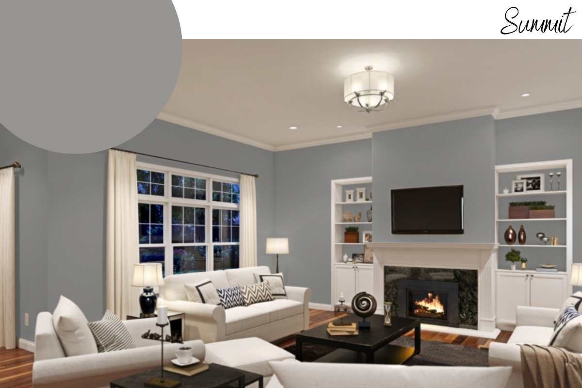
This list contains a lot of lighter grays, but if you’re looking for something darker, look no further than Summit Gray SW 7669. When we asked our team what the most neutral gray was, Summit Gray was a popular choice. It’s easy to see why.
This gray does not have a blue or green undertone, which is what most clients are trying to avoid when they choose a gray. This gray is particularly great for painting the exterior of your home.
Jogging Path is almost more of a greige color, but we’ll allow it because it’s just so beautiful! This gray has a lot of warmth in it, so it’s a great option if you’re a little nervous about taking the plunge into gray.
We particularly love this for a large open floor plan or in areas that you want to feel a bit bigger. Pair this color with deep navy and blues, oranges, deep reds, or earthy greens to create your perfect space.
For a neutral gray without a blue undertone, consider Gray Matters from Sherwin Williams. This is a light to medium gray that feels very neutral. It’s a great gray option if you have a lot of cooler-toned features in your home or if you’re just looking for that neutral gray color.
Neutral grays can end up feeling a little dull, so we recommend incorporating some kind of pop of color through your furniture, accessories, or an accent feature.
This is one of the warmest grays on our list, but we love a warm gray because it helps the color feel more dynamic and modern. Requisite Gray has a very red undertone so it will pair nicely with warm wood floors and crisp white trim. A color like this creates a little more interest than a flat, “true” gray because it opens up the space while adding warmth.
Here we have another warm gray, Colonnade Gray. This is a little bit lighter so it makes for a great interior color. It’s not quite as warm as Worldly Gray and has a little bit more depth to it, but should still keep your space nice and bright. As always, we highly recommend ordering some samples to test your colors before you commit.
Pussywillow has actually been a very popular exterior color in 2021. It’s not too dark and not too light, which means it has enough depth to keep from looking washed out on an exterior. This color also works very well on the interior and has a nice warm and welcoming finish.
Downing Stone is straight from the Sherwin Williams historical collection which means it’s been around for quite some time. This is a beautiful gray that pairs well with the other Victorian colors and it works with both warm and cool color schemes.
This might surprise you, but this is one of our most popular interior colors. Worldly Gray is often used throughout a home to create a cohesive and harmonious flow. It’s a very warm gray and it works exceptionally well with both warm and cool colors.
If you have a room that has both warm and cool fixed features, such as flooring and tile work, this color can help bring the space together.

We’ve seen clients get overwhelmed trying to pick a gray. This is typically caused by the struggle to find a gray without an undertone but trust us, that is not what you want. Most paints are composed of red, green, yellow, and blue pigments and to get a completely neutral gray you need to mix an even amount of colors or use black pigment.
So, why don’t paint companies make a completely neutral gray? Well, because it doesn’t look good. A completely neutral gray would not have an undertone and would therefore appear very flat and one-dimensional.
That is not ideal for any paint color. To get a rich, dynamic color you have to have an undertone. If you hate the blue or green undertone of a gray, then stick with the warmer grays we’ve recommended, or look for a gray with a red undertone.
Gray does not have to be a challenge if you approach it the right way. Make sure you’re looking at samples outside of a store. Store lighting is terrible and you may not be able to see and undertone while under fluorescent lighting.
Get some samples and try them out at your home so you can see how the gray will react in your space or on the exterior of your home. We hope this helps! To see some of our favorite gray homes be sure to follow us on Instagram where we post weekly!