
Call Us Today!
Call Us Today!


Once you’ve found your painter, choosing the right color scheme for the exterior of your home can be a daunting task. With colder weather right around the corner, we understand that time is of the essence and you may need to choose your paint colors quickly. As always, we’re here to help! Our certified color experts, Lexi and Whitney, have put together some of their favorite go-to exterior color combinations to help you get your home painted and protected before the snow flies.
Lighter color schemes can make the exterior of your home look larger and more open. They also tend to have better resistance to fading, which makes them a great option to explore. This exterior paint scheme utilizes Colonnade Gray SW 7641 for the body and Alabaster SW 7008 on the trim. This is a classic color combination that has a low contrast which feels cohesive and elegant. Colonnade Gray is a beautiful, warm gray. When paired with the slightly warm Alabaster white, it creates a welcoming color combination. 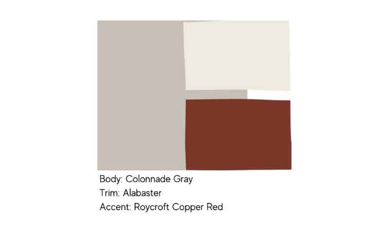 For this scheme we do have Roycroft Copper Red SW 2839 as an accent color for the front door. This is a rich red with a little bit of orange to help it pop, but we would not recommend this for shutters. If you have shutters on your home, consider doing those in your trim color (Alabaster) or use a black like Tricorn Black to complete the look.
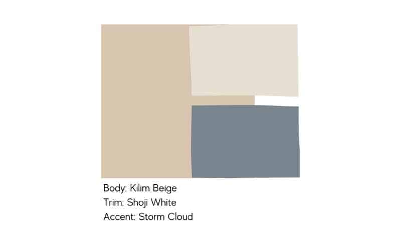
Beige is seeing a bit of a comeback as homeowners gravitate away from cooler blues and grays and back towards warmer earth tones. We love Kilim Beige SW 6106 because it isn’t too yellow or pink, it’s a nice neutral beige. This helps add warmth to your home without looking outdated or aged. Shoji White SW 7042 brings a bit of contrast to this exterior scheme and Storm Cloud SW 6249 adds a pop of color without overpowering the other colors. If a gray-blue like Storm Cloud isn’t your style you could absolutely sub that out for another option.
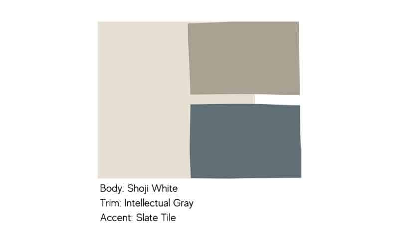
Shoji White makes another appearance here as the star of the show. Shoji White is a nice modern white that can work with both warm and cool colors. Here, we pair Shoji with Intellectual Gray SW 7045 on the trim. This is a very sophisticated and elegant exterior scheme and we love the combination. As an accent, we’ve chosen to keep things understated and cohesive by adding Slate Tile SW 7624 as our accent color. This can work on the front door and adds a bit of interest to the scheme.
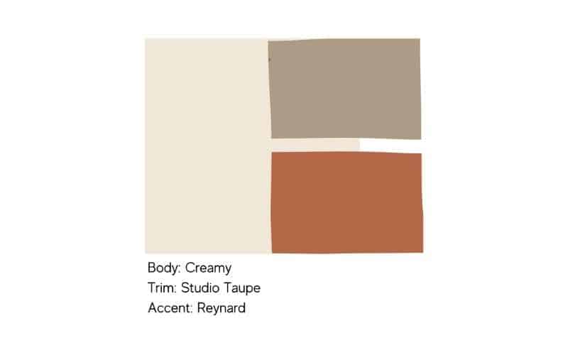
This exterior color combo is all about those nice warm undertones. Creamy SW 7012 is our base color and it has a richness that you won’t see in Shoji White or Alabaster. Pairing this with Studio Taupe SW 7549 helps bring out the warmth in both of these colors while also bringing a bit more contrast than our other two combinations. This is a very earthy scheme, so we chose to round it out with Reynard SW 6348 as the accent. This is another accent color that we wouldn’t necessarily recommend for shutters, but it’s a great pop of color on the front door, welcoming people to your home.
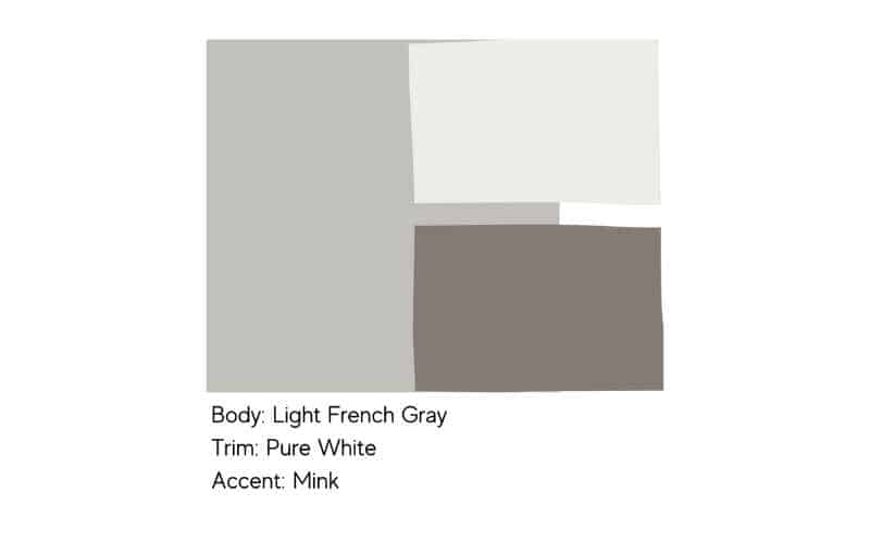
Last, but certainly not least of our top 5 light exterior color schemes, we have this timeless combination. Light French Gray SW 0055 is one of Lexi’s favorite colors and one she turns too, quite a bit. This is a great light gray that isn’t too cold. Pure White SW 7005 on the trim keeps this scheme sharp and we love the use of Mink SW 6004 as the accent color. Mink is a great color for shutters and doors and helps to bring sophistication to this scheme.
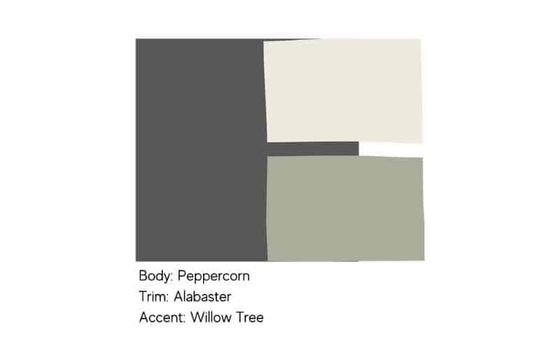
Darker body colors have dominated for the past few years, so if you’re loving this look then we’ve got some great options for you. For this first scheme, Peppercorn SW 7674 is a dark and dramatic base. We love peppercorn because it’s a fairly neutral gray without too much blue or purple in it. Alabaster SW 7008 on the trim helps to soften the look and we recommend this over a sharper, more crisp white. We’ve chosen Willow Tree SW 7741 as the accent color for a fun bit of interest, but you could easily swap that for a light blue, red, or orange door.
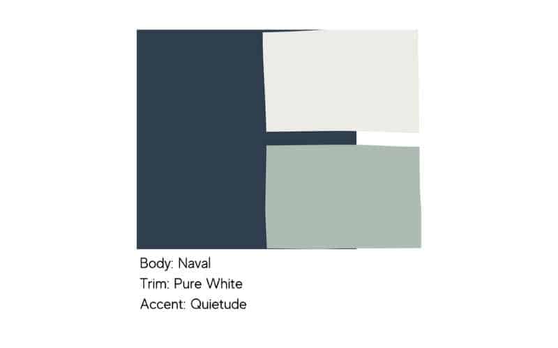
Naval seems to make nearly every list and for a good reason. Naval SW 6244 is the perfect navy blue for a deep, rich body color. For that classic, New England look, we’ve paired it with Pure White SW 7005. This has been a very popular exterior color combination and we love to see it on a craftsman-style home. For the accent, we’ve gone with Quietude SW 6212 which is a very fun front door color. Again, you could easily switch this out for a red door if you’re looking for something a little more patriotic.
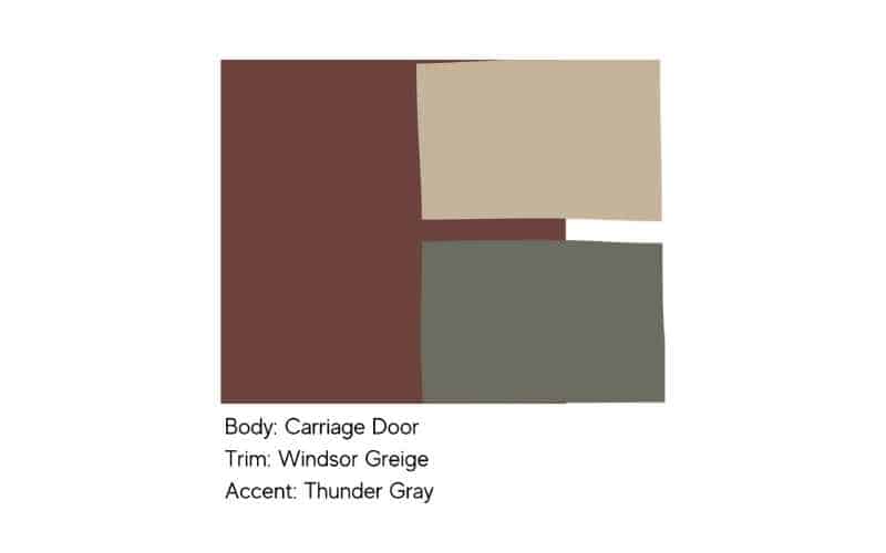
Red can be a tricky body color to get right. For an easy, go-to red that isn’t too bright, we love Carriage Door SW 7594. This is a really deep, rich red that has the right amount of depth for an exterior. Rather than pairing this with a white trim, we love a warm tan color like Windsor Greige SW 7528. This will help balance the contrast between the body and the trim to create a more welcoming exterior scheme. Green and red are complementary colors so we chose a beautiful gray-green for the accent with Thunder Gray SW 7645. This helps to keep the combination from looking too Christmas-y while also creating cohesion.
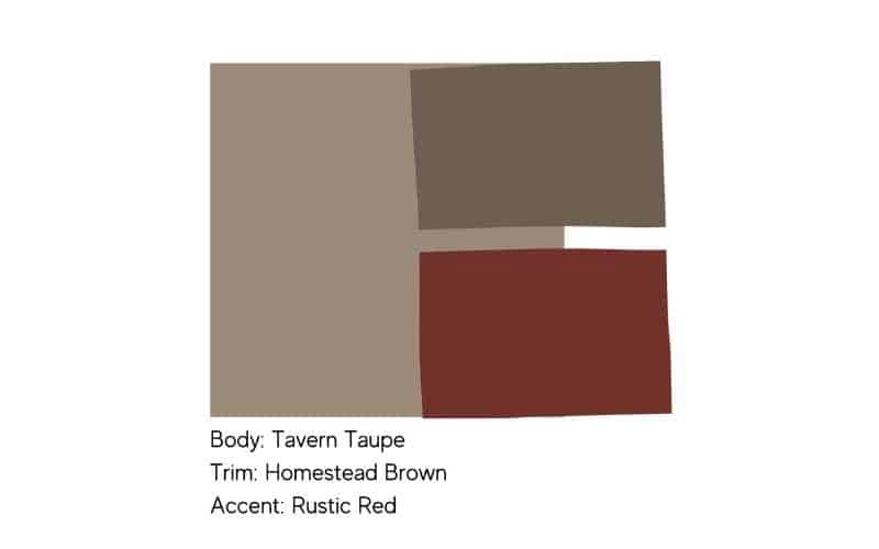
Here in Colorado, most neighborhoods feature a lot of earth tones. This helps homes blend in with the landscape and feel less obtrusive. That means browns can be very popular here so we had to include this combination. Here we have Tavern Taupe SW 7508 on the body of your home, which is contrasted with a rich, chocolatey brown on the trim, Homestead Brown SW 7515. These two browns have similar undertones which allows them to work well together. As a little pop of color, we went with Rustic Red SW 7593 on the front door. Again, we don’t typically recommend red on accents like shutters, so keep that in mind if you consider this scheme.
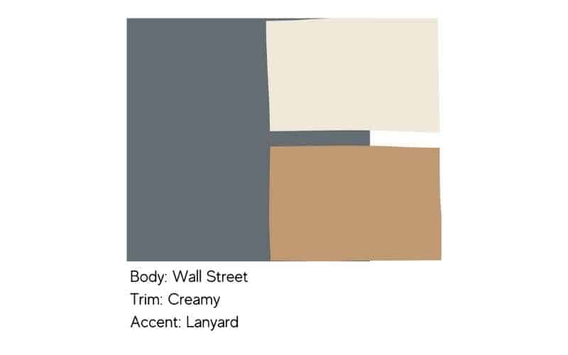
Rounding out our list for easy dark exterior paint color combinations, we have this beauty. For the body, we have Wall Street SW 766,5, which is a deep, slightly warm gray. This is a great gray option if you don’t like blue or green undertones in your grays. To contrast this, we have Creamy SW 7012 on the trim. Creamy is a warm white that brings a nice contrast without feeling too sharp. Lanyard SW 7680 is our accent color and we love this option. It’s a bit different from what you might normally see, but we think this slightly orange, leather-looking color is the perfect complement to the base and trim colors.
We hope this list has helped if you’re in a crunch to choose your paint colors quickly. For this list of our top exterior color combinations, we wanted to make sure to keep things fairly neutral and go with our tried and true color options. What do you think of these combinations and which is your favorite? Let us know over on our Facebook page and while you’re at it, check out our paint gallery and Instagram for even more color combo inspiration!
Are you planning to give your home’s exterior a fresh look? Don’t worry about choosing the perfect colors on your own. With winter coming up soon, time is of the essence. Let our color experts at Kind Home Solutions help you. Looking to enhance your home’s curb appeal? Take a look at our expert-recommended color schemes and have your home painted and protected before the snow arrives. Contact us today, and let’s make your vision a reality!