
Call Us Today!
Call Us Today!

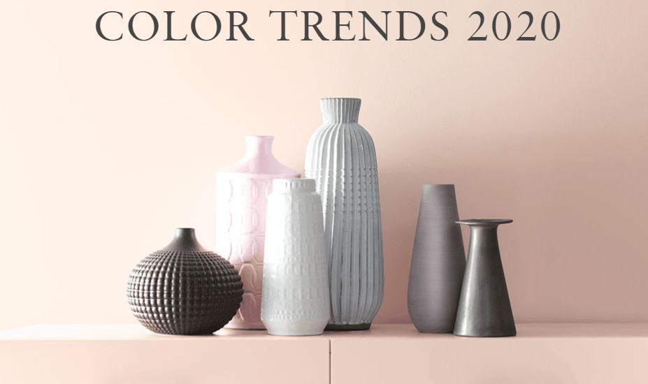
Can you believe we’re almost done with 2019?! We can’t either! Now that 2020 is almost here, it’s time to look forward to the top paint color trends from Benjamin Moore. Benjamin Moore’s Top Colors for 2020 is something we’ve been looking forward to all year! Let’s take a look at the top color trends and talk about what we think are good ideas for using these top colors!
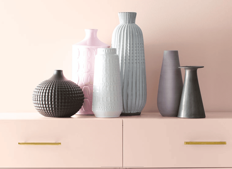
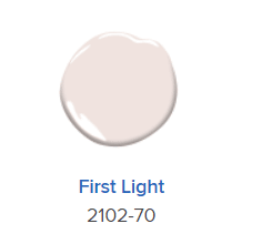
The top Benjamin Moore 2020 color is “First Light 2102 – 70” This is a soft rosy hue that is both bright and inviting at the same time. We feel it’s a great alternative to the standard beige or off-white, and is a great color that works with any interior space, from living rooms to bathrooms and more.
With “First Light 2102” leading the pack, the top colors in this palette are all harmonious, working well together or separately in any space in your home. Whether you’re looking for a striking accent color, or a palette that will work for larger spaces, 2020 has it all. Let’s take a look at all of the top 10 colors!
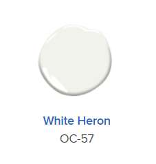 White Heron OC-57
A wonderful soft and bright off white, this color would be great for large living spaces to help brighten and enlarge the feeling of any room.
As the top Benjamin Moore color of 2020, we think this color could work in any room in your house! You could get creative with this color and pair it with any other color in the top colors palette!
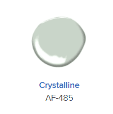 Crystalline AF-485
A soft and inviting light green, we could envision this color being a main color in smaller rooms, or an accent color that would work well with any of the other colors in this years palette. Pair it as trim with any of the
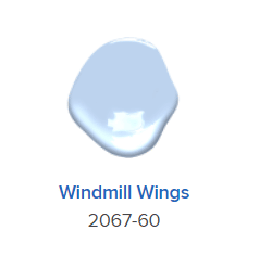 Windmill Wings 2067-60
A beautiful cool blue, Windmill wings would add a bright splash of color to rooms like bathrooms, bedrooms or more. It would pair beautifully with accent colors in the palette, or could even serve as a wonderful accent color itself!
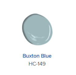 Buxton Blue HC-149
A fantastic mix of blue-green, Buxton Blue would work well as an accent color or stand on it’s own. We could see this as a single wall in a room with a variety of the other colors in the palette, or a great kids bedroom color even!
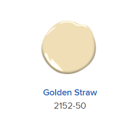 Golden Straw 2152-50
We see Golden Straw as a welcoming warm yellow-ish beige that would be a perfect addition to any larger room. This color would brighten main rooms like living and family rooms, especially if you paired it with a single wall accent color!
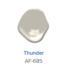 Thunder AF-685
Another great neutral color, Thunder would even work as a main color or a great accent color more on the neutral side! Don’t sleep on this color!
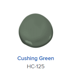 Cushing Green HC-125
This striking and rich green accent color pairs well with any of the other colors in this palette. This color invokes feelings of peaceful nature scapes and it’s rich green tones feel luxurious!
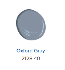 Oxford Gray 2128-40
A darker great with blue undertones, Oxford Gray adds a calming feel to any room you use it in. This color would work well with any other color in this year’s palette and unlike some other Gray’s out there, is far from boring!
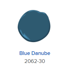 Blue Danube 2062-30
Another great calming blue tone, Blue Danube compliments this year’s whole color palette, and would also pair well with a large range of classic colors as well. Although it’s the last image in the palette, it’s by no means lesser!
We hope you like our breakdown of this year’s Benjamin Moore’s Top Colors for 2020! If you’d like to have a consultation with one of our interior painting experts we’d love to talk with you. Give us a call at 720-370-3063 or fill out our Estimate Request Form and we’ll get right back to you! From all of us at Kind Home Solutions, have a great 2020 year!