Choosing the Perfect Paint Color: Expert Tips for a Stunning Home
Your home’s paint color plays a crucial role in shaping its ambiance and overall aesthetic. Whether you’re moving into a new space, remodeling an existing one, or simply craving a change, selecting the right hue can feel overwhelming. But don’t worry—we’ve got you covered. This guide will walk you through essential tips and expert advice to help you choose the perfect paint color with confidence.
Factors to Consider When Choosing a Paint Color
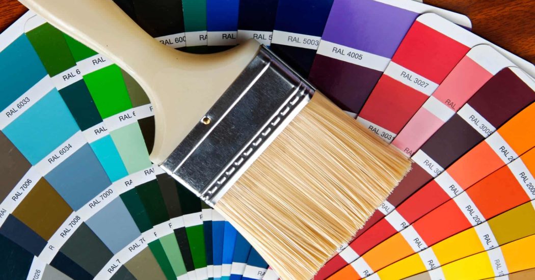
1. Understand the Basics of Color Theory
Before diving into paint swatches, it helps to grasp the basics of color theory:
Warm colors (reds, oranges, yellows) evoke energy and warmth.
Cool colors (blues, greens, purples) create a sense of calm and relaxation.
Neutrals (whites, grays, beiges) provide versatility and timeless appeal.
2. Consider the Room’s Purpose
Each room in your home serves a unique function, and the color you choose should complement that purpose:
Living rooms and dining areas: Warm, inviting tones like earthy neutrals or muted reds.
Bedrooms: Soft blues, greens, or pastels to encourage relaxation.
Kitchens: Crisp whites, cheerful yellows, or sophisticated grays.
Bathrooms: Cool blues, greens, or neutral shades for a spa-like feel.
3. Factor in Natural and Artificial Lighting
Lighting plays a huge role in how a color appears throughout the day:
North-facing rooms tend to have cooler, dimmer light, making warm tones a great choice.
South-facing rooms get ample natural light, allowing for both warm and cool tones.
East-facing rooms have bright morning lights, making soft blues and greens work well.
West-facing rooms see warm, golden hues in the evening, perfect for warm neutrals.
Selecting a Cohesive Color Palette
1. Start with a Neutral Base
A neutral foundation provides flexibility and allows for easy accenting. Classic choices include:
Warm beige
Soft gray
Crisp white
2. Use the 60-30-10 Rule
A well-balanced color scheme follows this simple formula:
60% dominant color (walls)
30% secondary color (furniture, upholstery)
10% accent color (decor, artwork)
3. Coordinate Colors Room-to-Room
A home should feel cohesive, not disjointed. Consider:
Using varying shades of a single color.
Selecting complementary colors from a color wheel.
Incorporating analogous colors for a harmonious flow.
Popular Paint Colors and Their Effects
Timeless and Versatile Colors
Greige (Gray + Beige): A sophisticated, warm neutral that adapts to various styles.
Navy Blue: Elegant and bold, perfect for accent walls or cabinetry.
Sage Green: A soothing color that brings the outdoors in.
Soft White: Creates a bright, airy, and clean atmosphere.
Trending Colors for 2025
Dusty Rose: A muted pink for a chic, modern touch.
Moody Teal: A deep, dramatic hue ideal for cozy spaces.
Earthy Terracotta: Adds warmth and character to any room.
Testing and Finalizing Your Paint Choice
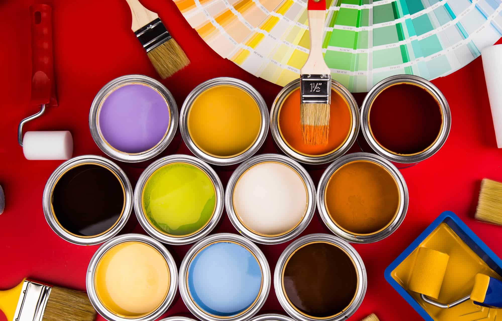
1. Try Paint Samples First
Instead of committing to a full wall immediately, purchase small paint samples and apply them to different walls. Observe how they change under different lighting conditions throughout the day.
2. Use Peel-and-Stick Paint Samples
Companies like Samplize offer peel-and-stick paint samples that allow you to test colors without the mess of painting.
3. Consider Undertones
A color may look neutral on a swatch but has unexpected undertones when applied to walls. Always compare shades against existing furniture and decor.
Make Your Space Uniquely Yours
Choosing the perfect paint color is a personal journey. Consider your design preferences, lifestyle, and how you want each room to feel. Whether you go bold or stay neutral, the right paint can transform your space into a beautiful and inviting home.
Ready to start painting? Grab your swatches, test out shades, and create a home that reflects your style and personality!
Ready to give your home a fresh, stunning look? Trust the experts at Kind Home Solutions for top-quality painting and home improvement services. Contact us today for a free estimate and experience the difference of working with a team that truly cares about your home!


 Timeless and Versatile Colors