
Call Us Today!
Call Us Today!
Have you ever walked into a room and instantly felt a certain mood or emotion? Chances are, the colors used in the interior painting played a big part in creating that atmosphere. Understanding the basics of color psychology in interior design can be a powerful tool when it comes to choosing the right colors for your home.
The impact of color on human psychology has long been studied and recognized. From influencing our moods and emotions to affecting our behavior and perception, color can have a powerful subconscious influence on us. In the context of interior painting, choosing the right colors can transform a space from dull and uninspiring to vibrant and energizing.
Whether you are redecorating your home or starting from scratch, understanding color psychology is essential to creating a space that not only looks visually appealing but also promotes the desired atmosphere and ambiance.
By learning the basics of color psychology, you can unlock the potential to create a home that not only looks beautiful but also feels comfortable and harmonious.
Color psychology is the study of how different colors can impact human emotions, behavior, and perceptions. It is understood that certain colors can evoke specific feelings or reactions in individuals.
This knowledge is often used in marketing and branding to create a desired emotional response or association with a product or brand. For example, the color red is often associated with excitement and passion, while blue is associated with trust and calmness.
Understanding color psychology can be valuable in different industries, such as graphic design, advertising, and interior design. Color psychology allows professionals to strategically use colors to achieve specific goals or messages.
The field of color psychology explores how different colors can affect our feelings and behavior. This also applies to how we choose colors for our living room, dining room, or even bathroom.
When it comes to interior painting, understanding color psychology can help you create a space that not only looks aesthetically pleasing but also promotes the atmosphere and mood you desire.
By using the right colors in different spaces, you can create the desired ambiance and evoke specific emotions. Here’s how color psychology in interior painting can be utilized to transform your living spaces:
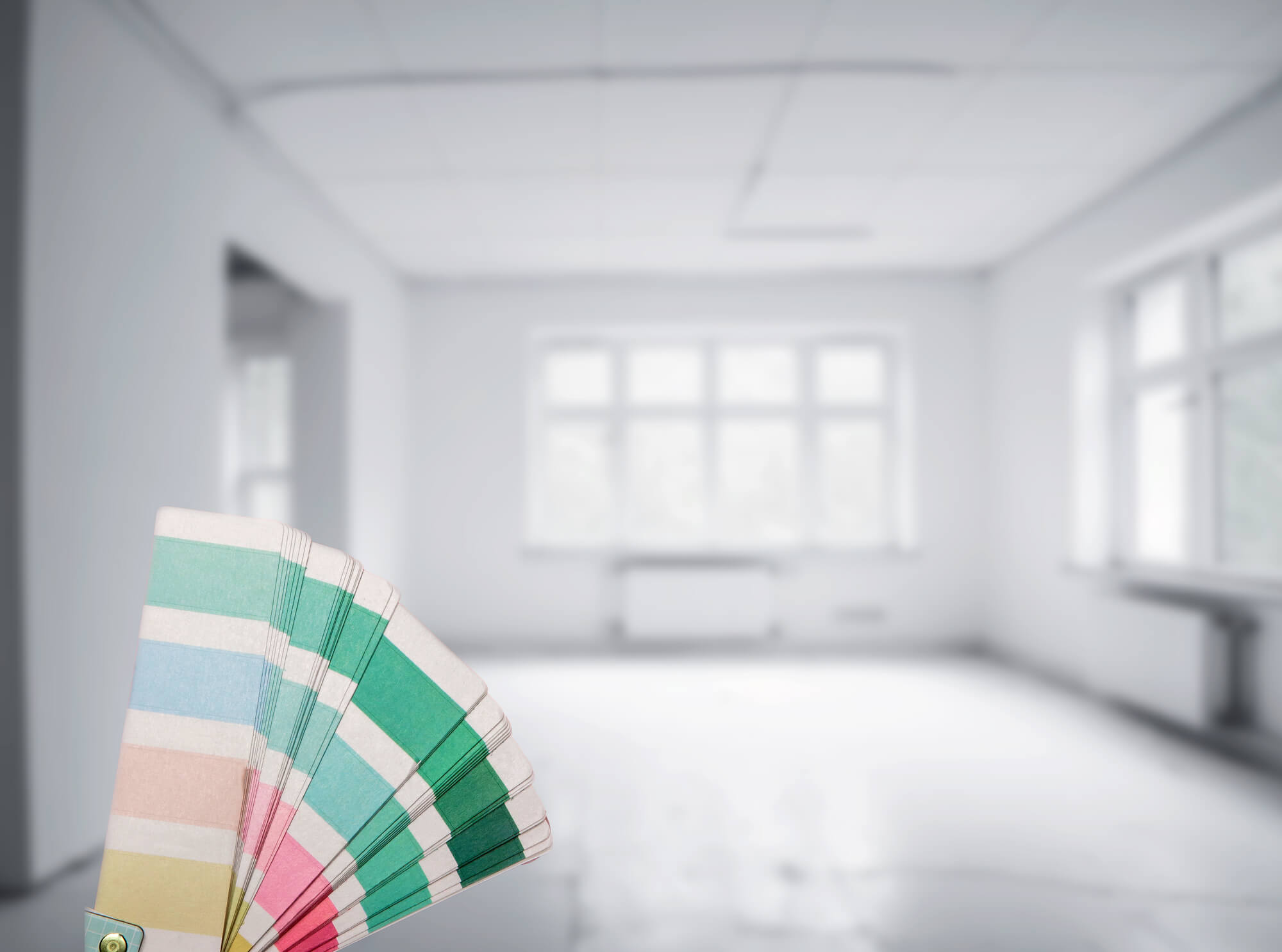
Color schemes are easy ways to mix and match colors. It also shows that colors in different shades or hues can work together in harmony to create balance.
Warm colors, such as red, orange, and yellow, are known to create an inviting and cozy atmosphere. These colors are often associated with warmth, energy, and passion. They can be used in living rooms, dining areas, or any space where you want people to feel comfortable and lively.
Cool colors like blue, green, and purple have a calming effect on our minds and bodies. They are often used in bedrooms, bathrooms, or any area meant for relaxation and tranquility. These colors promote peacefulness, harmony, and serenity. Lighter shades of blue can make small spaces appear larger, while darker shades can create an intimate and serene environment.
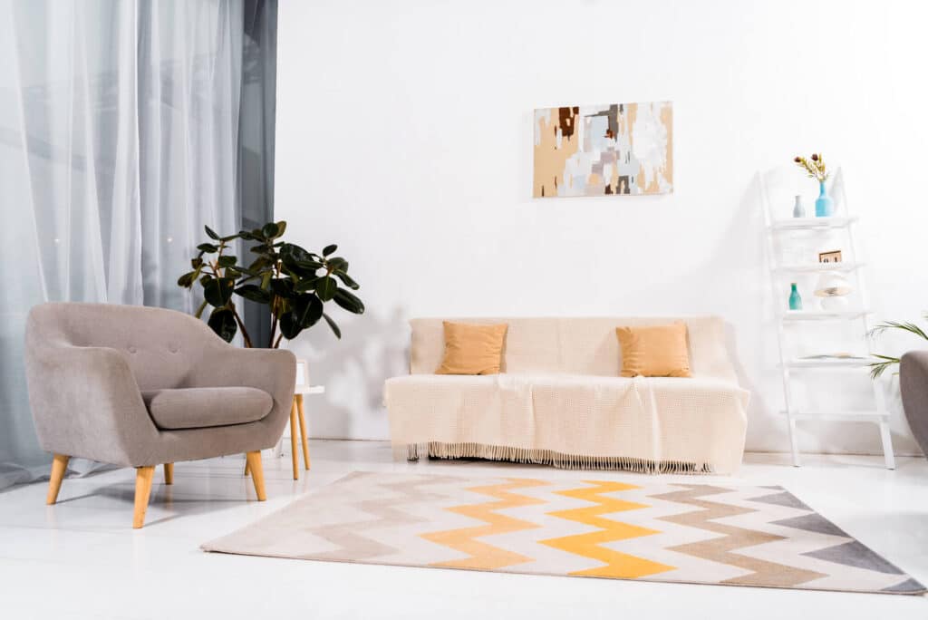
Neutral colors, such as beige, gray, and white, are versatile and timeless. They are often used as a base color in interior painting, as they provide a neutral backdrop for other elements in the room. Neutral colors create a sense of balance, simplicity, and sophistication. They can be combined with any other color to create a cohesive and harmonious look.
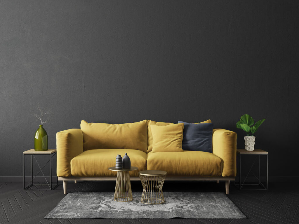
Accent colors are used to add pops of color and visual interest to a room. These can be bold and vibrant colors like red, orange, or yellow, or even contrasting colors like black or dark blue. Accent colors are often used on a single wall, furniture, or artwork to create a focal point and draw attention. They can add excitement, energy, and personality to a space.
Some colors are often associated with their functions. For example, lighter colors such as peach and beige are often associated with the kitchen or living room, while darker hues such as forest green and navy blue are often used in bedrooms since they represent comfort and serenity, where most people feel the safest.
A vibrant and energetic color like red might not be suitable for a bedroom, but it could work well in a workout room where you want to boost motivation and energy.
Furthermore, natural light plays a significant role in how colors appear in a room. A color that looks vibrant in a well-lit space might appear dull in a room with minimal natural light. Consider the lighting conditions and how they will interact with your chosen colors.
Warm and vibrant colors may not be suitable for a workspace where focus and concentration are required. Similarly, cool and calming colors may not be ideal for a social gathering space where energy and liveliness are desired.
While understanding color psychology can provide valuable insights, it’s always beneficial to consult with professional interior painters or color consultants. Kind Home Solutions has a team of Colorado professional home painters who can guide you in selecting the right colors based on your preferences, the room’s function, and lighting conditions.
We can also help you create a cohesive and harmonious color scheme that enhances the overall ambiance of your home. Contact us to learn more.
The choice of colors used in an interior painting can greatly impact the mood and emotion in a room. Whether you want to create a peaceful sanctuary or a vibrant and energetic space, understanding the psychology behind colors is key.
Let’s explore how different colors can evoke different emotions and how to effectively use them in interior painting.
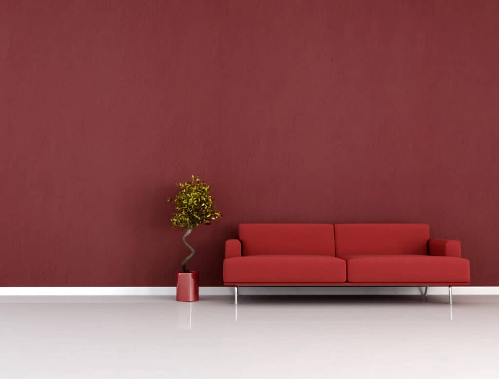
The use of red color in interior painting has a significant impact on mood and emotion. Red is a vibrant and energetic color that can evoke strong emotions such as passion, love, and excitement. It is often associated with warmth and can create a cozy and inviting atmosphere in a room.
It’s advised to use red in moderation, as excessive use of it can be overpowering and can even invoke feelings of anger or aggression. The shade and tone of red also play a crucial role in determining the emotional impact it has on a space.
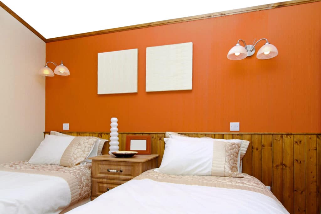
Orange is often associated with energy, enthusiasm, and creativity. It is a warm and vibrant color that can create a sense of warmth and excitement in a room. The use of orange in interior painting can stimulate and invigorate the senses, making it an ideal choice for rooms where socializing and activity take place, such as living rooms or kitchens.
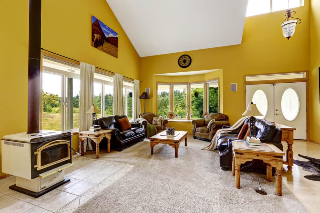
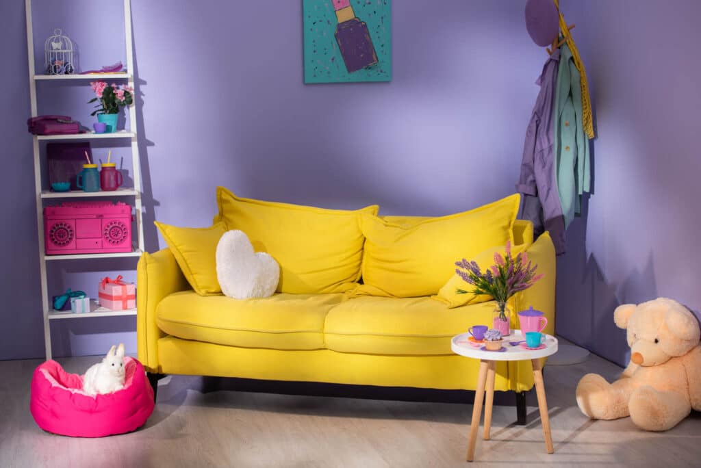
The color yellow is often associated with feelings of positivity, happiness, and energy. When used in interior painting, it can have a significant impact on the mood and emotions experienced in space. Yellow is known to stimulate the brain and promote feelings of optimism and cheerfulness.
It can create a warm and inviting atmosphere and is often used in spaces where people gather, such as kitchens and living rooms. If you don’t want to get overwhelmed with using this color, consider the intensity and shade of yellow used. You can match it with green or blue hues to create balance.
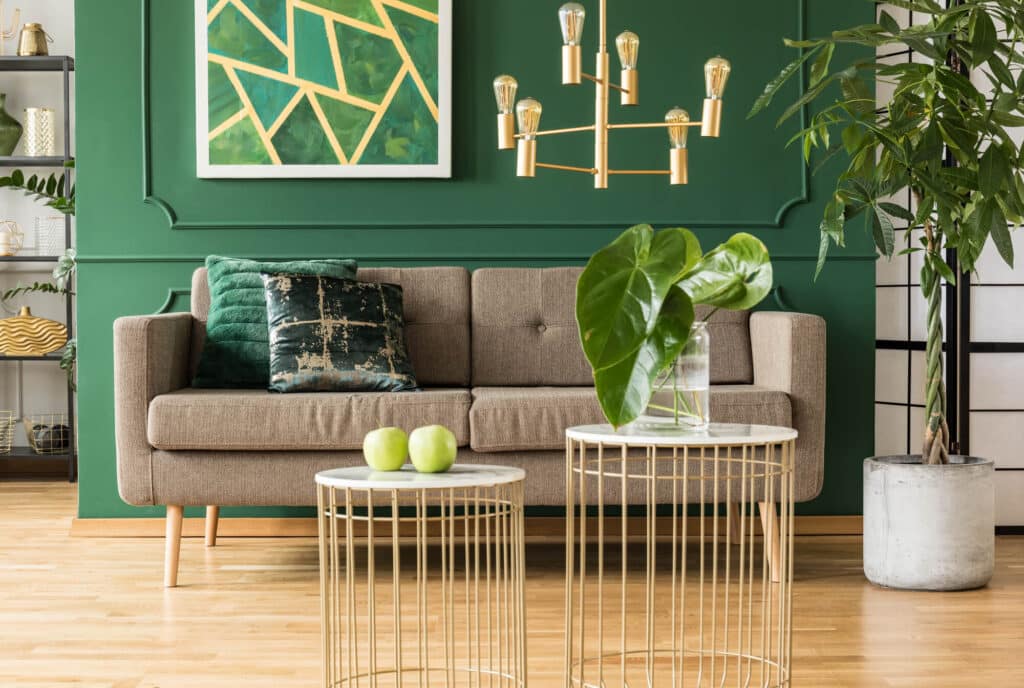
As a color often associated with nature and growth, green has a calming and refreshing effect. It promotes feelings of balance, harmony, and relaxation, making it an ideal choice for bedrooms, living rooms, or any area where a sense of tranquility is desired.
Green is known to enhance creativity, making it a great option for home offices or creative spaces. However, it’s important to consider different shades of green, as lighter tones may have a more calming effect, while brighter shades can provide a burst of energy and optimism.
Overall, the selection of green in interior painting can greatly influence the ambiance of a room and contribute to a positive and inviting atmosphere.
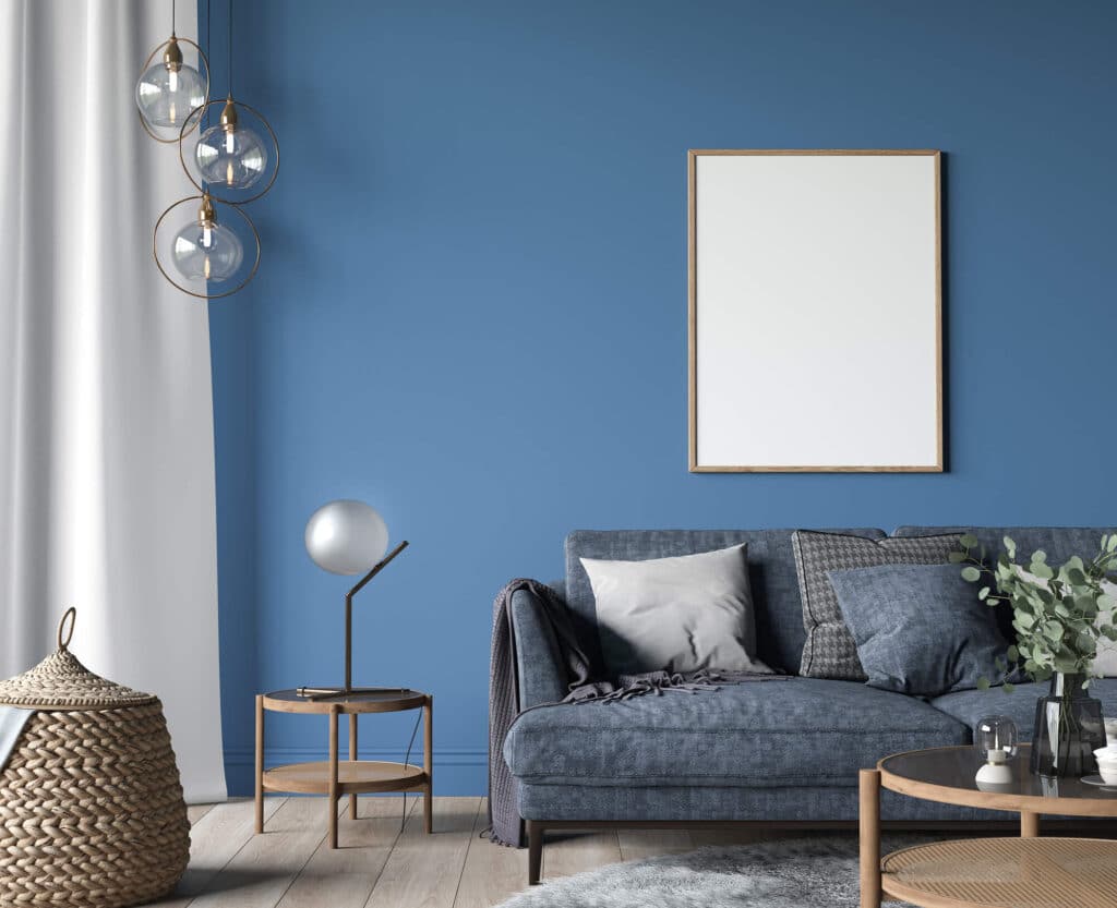
Blue is often associated with feelings of calmness, peace, and tranquility. It has a calming effect on the mind and body, making it a popular choice for bedrooms and relaxation spaces. Blue can also evoke feelings of trust, loyalty, and intelligence, making it suitable for offices and study areas.
Note: Different shades of blue can evoke different emotions. Lighter shades tend to be more soothing and calming, while darker shades can evoke a sense of melancholy or sadness.
The use of purple in interior painting can have a significant impact on the mood and emotions of individuals. Purple is often associated with creativity, spirituality, and luxury. It has a calming and soothing effect on people, making it a great color choice for bedrooms or areas where relaxation is desired.
On the other hand, purple can also evoke feelings of mystery and royalty, adding a touch of elegance and grandeur to a space. However, it is important to consider the shade of purple used, as darker shades may create a more dramatic and intimate atmosphere, while lighter shades can create a softer and more tranquil ambiance.
Understanding how the purple color can influence mood and emotion allows homeowners to strategically incorporate it into their interior painting choices to create the desired atmosphere in their living spaces.
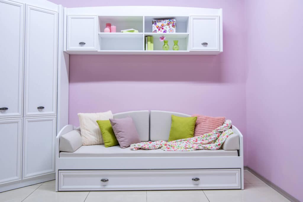
The color pink is often associated with feelings of tranquility, warmth, and happiness. It has a calming effect on the mind and can create a soothing atmosphere in a room. Pink is also known to evoke feelings of romance and femininity, making it a popular choice for bedrooms and spaces where relaxation is desired.
However, it is essential to consider the shade and intensity of pink used, as different hues can evoke different emotions. The careful selection and application of pink in interior painting can greatly influence the ambiance and emotional experience of a room.
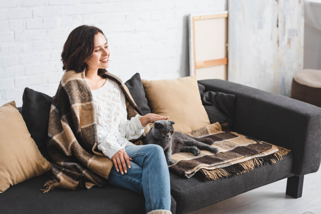
Black is often associated with elegance, sophistication, and power. When used in interior design, it can create a sense of drama and provide a bold statement. It’s by far one of the easiest colors to deal with since it can be paired with any color.
Grey carries a range of associations and can evoke various emotions depending on its shade and context. Lighter shades of grey tend to create a sense of calmness and tranquility, making them ideal for spaces that require a soothing atmosphere, such as bedrooms or meditation areas.
On the other hand, darker shades of grey can evoke a sense of mystery and sophistication, making them suitable for creating a moody and dramatic ambiance in spaces like dining rooms or home libraries. The psychological effects of color, including grey, are essential in creating a harmonious and emotionally appealing interior design.
The use of white color in interior painting can have a significant impact on one’s mood and emotions. White is often associated with purity, cleanliness, and simplicity. It can create a sense of calmness and serenity in a space, making it an ideal choice for bedrooms or relaxation areas.
White can make a room feel more spacious and open, giving a sense of freedom and clarity. On the other hand, too much white can also evoke feelings of emptiness or sterility, so it is crucial to find the right balance and incorporate other colors or elements to bring warmth and personality to the space.
Whether it is warmth, tranquility, balance, or visual interest, colors have the power to make a significant difference in how we experience and interact with our surroundings. By understanding the impact of different colors on emotions and behavior, you can choose the right colors to create the desired ambiance and transform your living spaces.
To make an informed decision on the best color or colors to use for your interior design, give Kind Home Solutions a call. We have the expertise and knowledge to guide you through the color selection process based on your preferences, the intended atmosphere, and the existing elements in the space.
Call Us Today!