
Call Us Today!
Call Us Today!
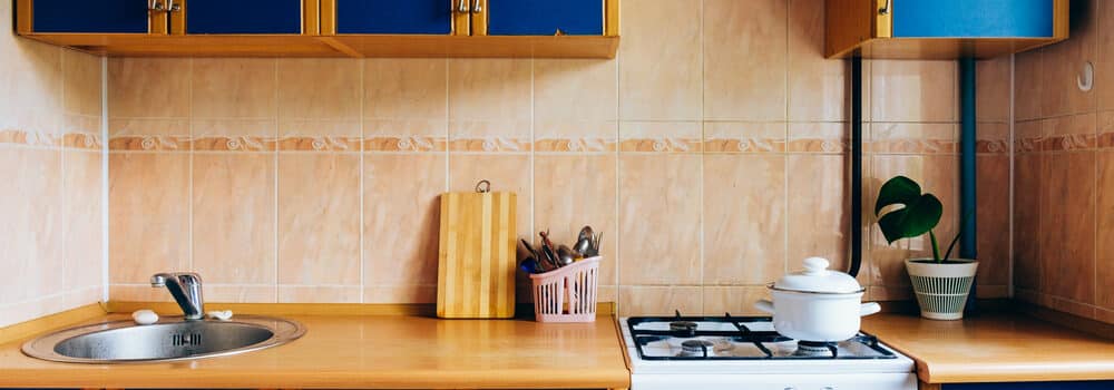
Choosing an ideal color palette can make or break your kitchen. Colors not only drive the aesthetic of your kitchen but serve a function as well.
Colors can be tricky to deal with. Let Kind Home Solutions help you navigate and choose colors that will bring out the beauty of your kitchen.
Contact us to learn more about our kitchen painting or our Colorado home painting service.
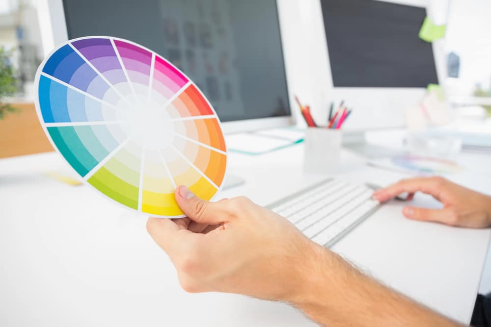 The color wheel is a circular diagram that represents the relationships between colors.
It’s an essential tool for understanding how colors work together and creating a harmonious color scheme. The color wheel has three primary colors: red, blue, and yellow.
These colors cannot be created by mixing other colors, and all other colors derive from them.
Secondary colors are created by mixing equal parts of two primary colors. These are green (blue and yellow), orange (red and yellow), and purple (red and blue). Tertiary colors result from mixing a primary color with a secondary color.
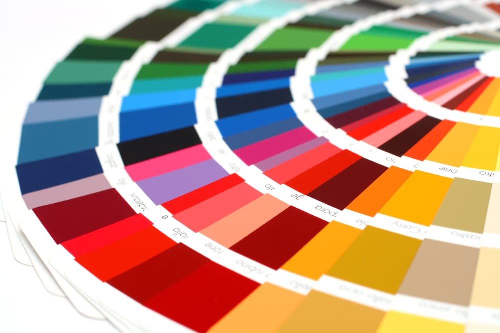
Color harmonies are specific combinations of colors that work well together and create a visually appealing and balanced design. Some common types of color harmonies include:
Colors can bring up different emotions and psychological responses in people. Understanding the psychology of colors can play a significant role in creating a kitchen atmosphere that suits your preferences.
Here’s a brief overview of common colors and their associated feelings:
 Red: Stimulating, energetic, appetizing. Red is known to increase appetite, making it a popular choice for dining areas and restaurants.
Smaller kitchens can benefit from lighter colors. This creates a more spacious and open feeling. Larger kitchens can handle darker or bolder colors without feeling cramped.
Below are some quick tips based on kitchen size:
Pro tip: Use vertical lines to emphasize the height of the room and horizontal lines to emphasize its width.
The amount and type of lighting in your kitchen will greatly influence the perception of colors. Assess the amount of natural light coming through windows, as well as the intensity and position of artificial lighting sources. Use this information to make informed color choices:
| Lighting Condition | Color Suggestions |
|---|---|
| Abundant natural light | Light or dark colors, bolder patterns |
| Limited natural light | Light colors, reflective surfaces |
| Artificial lighting | Balance lighting temperature with complementary colors |
Remember: Light colors reflect more light, while dark colors absorb it. You can add lighting sources, such as lamps, to create a balanced atmosphere.
Follow these general rules:
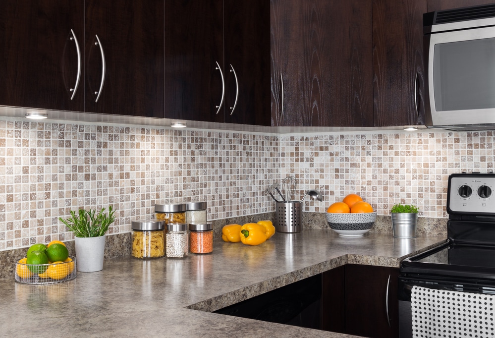
For countertops, backsplashes, and flooring, look for a color scheme that unifies the elements above to create harmony with the colors.
A focal point can be an architectural element, such as a large window a beautiful stove, or a bold color that anchors the room’s design. By identifying your focal point, you can build the rest of your color palette around it, ensuring a cohesive and harmonious look.
Key considerations when choosing a focal point:
Once you’ve identified your focal point, it’s time to balance the other colors in your space. Go for a mix of light, medium, and dark shades to create depth and interest.
Use the 60-30-10 rule as a guideline:
Complementary Colors are opposites on the color wheel, creating high-contrast and visually striking designs. Examples include:
Analogous Colors are adjacent on the color wheel, imparting a more harmonious and subtle aesthetic. Examples include:
Both schemes have their best features, and the choice ultimately depends on your personal preferences and the atmosphere you want to create in your kitchen. Keep these concepts in mind as you settle on your color palette, helping you create an appealing, balanced, and visually satisfying space.
 For countertops, granite, quartz, and laminate are popular choices. Granite and quartz offer a luxurious, high-end appearance, while laminate is budget-friendly and versatile.
Choose a finish that best complements your chosen material:
For backsplashes, consider tile or a material that matches your countertop. Some options include:
Popular material options include solid wood, MDF, or plywood. Not sure what to decide? Check out the table below.
| Material | Pros | Cons |
|---|---|---|
| Solid Wood | Durable, Classic Appearance, Customizable | Expensive, Subject to warping/humidity |
| MDF | Budget-friendly, Stable, and customizable | Less Durable, Swells with water exposure |
| Plywood | Durable, Versatile, Cost-effective | May show exposed edges or layers |
Get a cabinet painting service with us today at Kind Home Solutions.
Select a finish to match your material choice, such as paint, stain, or a mix of both. For hardware, consider the style and material that pair well with your cabinets:
Your flooring should be both practical and visually appealing. Some popular options:
Choose a finish that complements your kitchen’s overall color scheme and style. Consider wall paint that contrasts or complements your cabinetry, with options such as:
The “rule of three” suggests using three main colors to create harmony and balance: primary, secondary, and accent.
Typically, you will have one dominant color, one secondary color, and one accent color. Find the proper balance to avoid overwhelming your kitchen with too many colors.
Transitional Spaces
Some materials may appear beautiful, but cannot last on regular wearing and tearing. Below is a more in-depth look at the durability of each material.
| Material | Durability | Pros | Cons |
|---|---|---|---|
| Granite | High | Resistant to heat, scratches, and stains | Requires periodic sealing |
| Quartz | High | Low maintenance and non-porous | Sensitive to extreme heat |
| Laminate | Moderate | Budget-friendly and easy to clean | Prone to scratches and burns |
| Marble | Moderate | Adds luxury and elegance | Porous and prone to stains |
| Ceramic Tiles | Moderate | Versatile and heat resistant | Grout lines can attract dirt |
Light colors tend to show dirt, stains, and fingerprints more easily compared to darker shades. But dark colors may make your kitchen space appear smaller.
There’s no rule set in stone when it comes to adding color to your home. At the end of the day, choose colors that will make you happy. Let us guide you through that journey at Kind Home Solutions.
In 2023, trending color palettes for kitchens will focus on a blend of natural and earthy tones with accents of vibrant colors. Warm, muted shades such as beige, cream, and olive green are popular choices, while bolder colors such as navy, mustard yellow, and emerald green are used to create striking contrasts.
The best color combinations for kitchen cabinetry depend on personal preferences and the overall design aesthetic. But some classic combinations include white cabinets with black or gray countertops, navy blue cabinets with white or marble countertops, and light wood cabinets with either dark quartz or concrete countertops.
Consider the size, layout, and natural light in the space. Lighter shades can create a sense of openness and brightness, while darker tones can add depth and intimacy. Don’t forget to factor in your cabinets, countertop, and flooring colors, as well as any accent colors you plan to use in your design.
While there are no fixed rules to follow when designing a kitchen’s color scheme, some general guidelines can help create a cohesive and harmonious space. First, choose a primary color for your cabinetry and walls. Then, select a complementary or contrasting color for your countertops, backsplash, and flooring. Finally, integrate accent colors through accessories, textiles, and decorative elements.
Popular modern colors for kitchen remodels include various shades of white, gray, blue, green, and black. These colors work well in contemporary settings and can be paired with accents in metallic, wood, or stone textures. Additionally, bold colors like orange, yellow, and red can be used as accent colors to create visual interest and enhance the overall design.
A color palette generator can be a helpful tool when planning a kitchen design. These online tools use algorithms to generate complementary and contrasting color schemes based on an input color. By using a palette generator, you can discover new color combinations that work well together and ensure a visually harmonious kitchen design.
Call Us Today!