
Call Us Today!
Call Us Today!

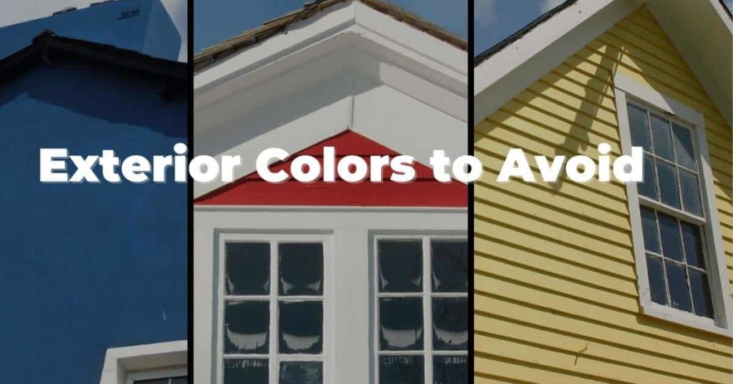
Everyone always wants to know which paint colors are the best, but what about the exterior paint colors you should avoid? If you understand which paint colors or color families to avoid on the exterior of your home, it can make the color selection process a little easier. There is a time and place for all colors, but exterior paint colors can be a little tricky. We provide painting services to the Denver metro area, so we’ll be focusing on paint colors that our Colorado homeowners should avoid. However, you can also consider these guidelines for exterior paint colors you should avoid if you are in other areas of the country.
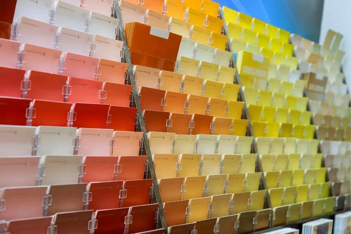 Whether you’re considering Sherwin Williams, Benjamin Moore, or some other paint brand it’s important that you avoid the “color” section for your exterior paint colors. This section of paint is made up of bright, bold, and highly pigmented colors. This does not mean you can’t use “color” on the exterior of your home, but in general, you should look at very specific sections or color groupings when it comes to the exterior of your home. Look for collections labeled Neutral, Timeless, or Historical. These collections will ensure you choose colors that are better suited for exterior painting.
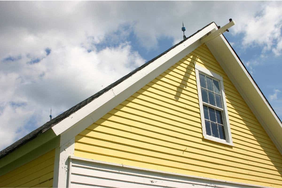
Yellow makes the top of our list for a number of reasons! Primarily because it is so susceptible to fading. With the amount of sunshine we get here in Colorado, it’s always wise to take that into consideration when choosing exterior paint colors. Due to the pigments used in yellow paints it tends to fade quite quickly. This also means that many yellows are what we call “interior only” paint colors. That means most yellows cannot even be made into exterior paint products. Yellow also doesn’t really fit the Colorado aesthetic for homes. Yellow isn’t really an earthy tone, so sticks out like a sore thumb. It’s best to find a unique color that is able to blend in and feel cohesive with the surrounding landscape. If your heart is set on yellow we recommend compromising a little bit. You can use it as a door color to create a fun pop of color without throwing off the scheme within your neighborhood.
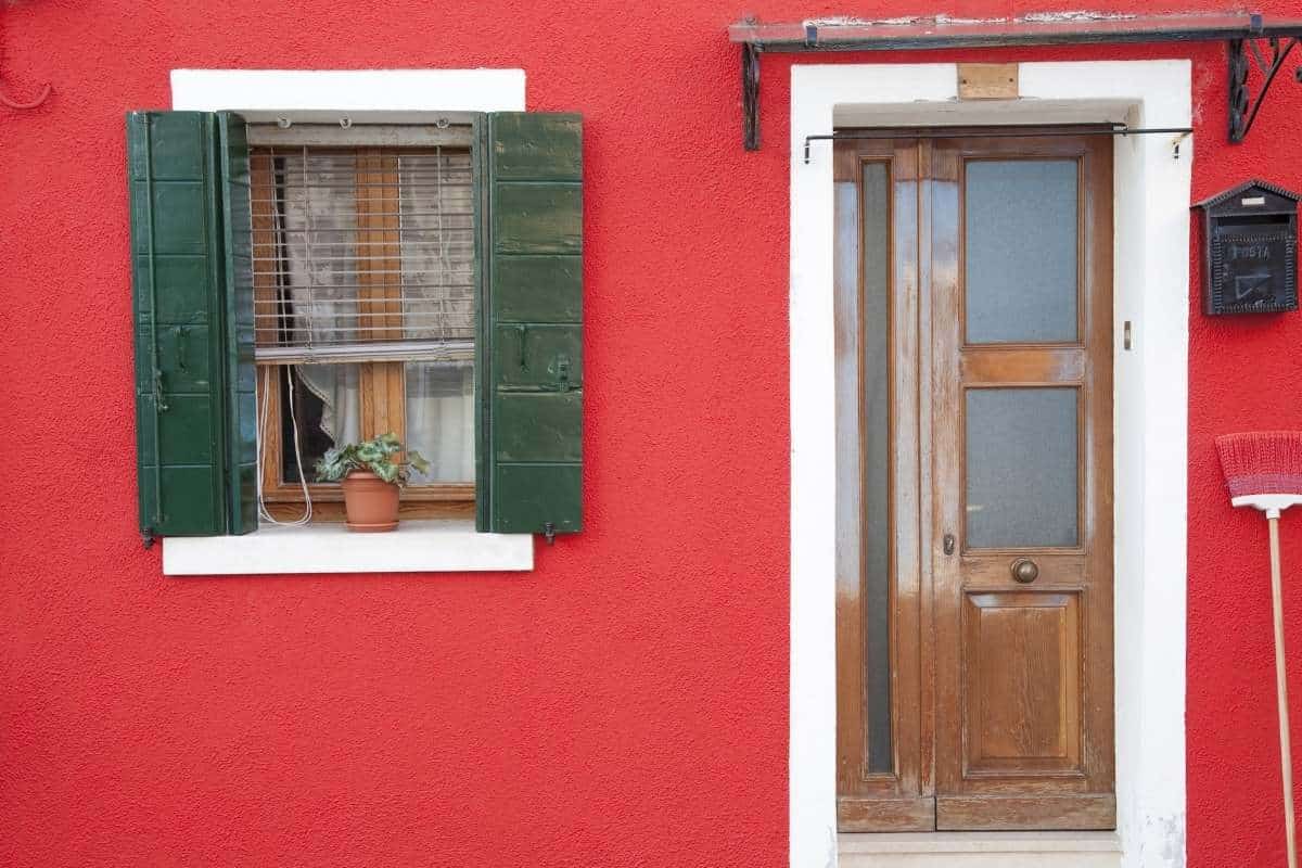
Red paint colors are very similar to yellows in the sense that they tend to fade quite quickly. Most often we see homes painted in a classic red and white combination, which reads very “barn” in our opinion. Or we’ll see it paired with green sometimes. Red and green can feel very Christmas-y because many people associate those colors with that holiday. So, we often recommend avoiding this combination just to be safe. One of the best ways to utilize red is to use it as an accent or front door color. Just note–– if you plan to use red on accents like shutters, then you’ll want to choose a very deep red with a bit of brown. Colorful, bright reds can end up feeling slightly clownish. The added depth helps to tone things down and feels a bit more harmonious.
The deep navy trend has been going strong here in Colorado since 2019. Even though it has slowed down a bit, we are still seeing plenty of homes that feature the New England inspired hue. The trick with finding the perfect blue is to make sure it has a lot of gray in it. Gray-blues will always read as blue, especially on the exterior of your home. So, you don’t need to go super blue to get the effect you want. When it comes to exteriors, you should look for colors that are more subtle and nuanced rather than vibrant and “true” to the color. Those rich, bold blues like Salty Dog SW 9177 or Smoky Blue SW 7604 are actually much more pigmented in real life. They can appear quite playful, which may not be the look you’re going for.
One of the most important things you have to account for when selecting paint colors for the exterior of your home is how bold the color will be. Here in Colorado we get a ton of sunlight year round, so paint colors tend to look bolder and brighter on the exterior of your home. The best way to combat this is to choose colors from the correct color collection and look for colors that have a slightly gray undertone. A gray undertone will help ground the color and dull some of the saturation. This is very important for exterior paint colors. The gray undertone creates a natural, less intense color and it can help things feel more cohesive. It also tends to work better with fixed, earthy features like brick or stone.
At the end of the day, it is your home and you should do what you like. You can never make everyone happy with your color selection. If you’re concerned about what the neighbors will think, neutrals are a pretty safe bet. Many clients want a fun, colorful look and truth be told, color preference is very personal. You should 100% do what you like. Just be sure to get large paint samples before you commit to a color. You should always consider how those colors will look on a larger surface like the exterior of your home. If you’re nervous about your color selection, consider getting a professional color consultation or follow us on Instagram to see a variety of house color combinations that might work for you!