
Call Us Today!
Call Us Today!

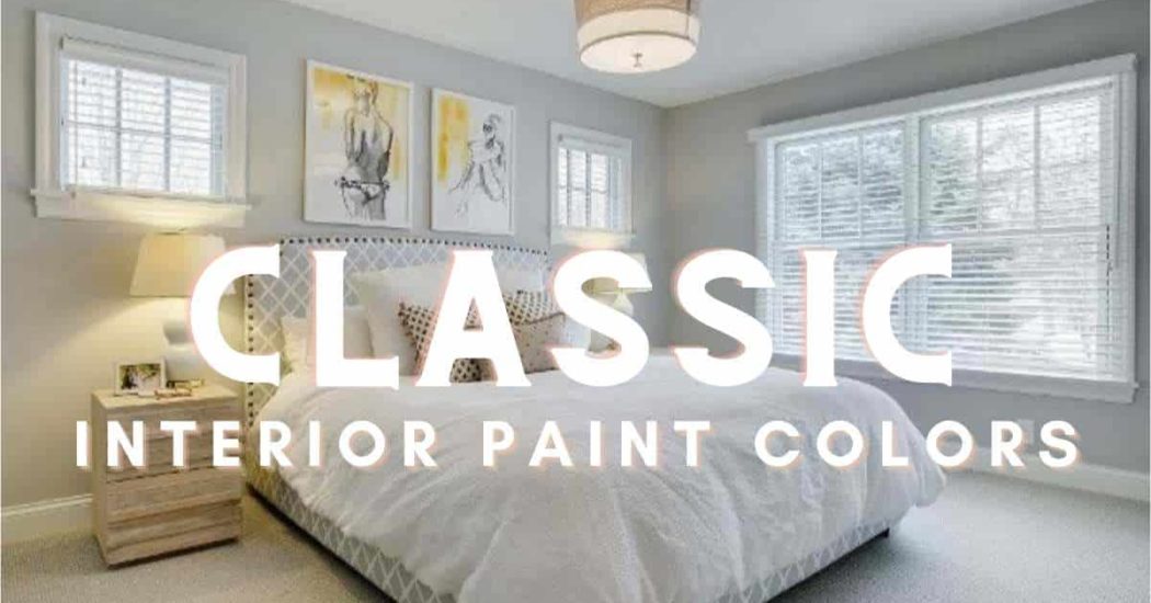
The right paint color for your interior can transform a space and create an atmosphere. As we already know, choosing the right paint color to suit your space and personality can be a challenge. From color families to undertones and LRV (light reflectance value), it can be a little overwhelming. To ease the pain for you, we’ve asked our expert color consultants to fill us in on classic interior paint colors that never fail.
White interiors are incredibly popular because it’s an easy way to create a blank canvas that feels bright, open, and airy. Your space and the lighting will really determine which white paint colors work best for you; however, there are a few that we turn to quite frequently with clients. We recommend looking for a white that doesn’t feel too stark or cold. That means avoiding white colors with a blue undertone. For an interior white with just a touch of warmth, we recommend considering Shell White SW 8917, Shoji White SW 7042, and White Heron SW 7627.

Aside from white, a balanced neutral is another common request from clients. Neutrals might seem easy, but for most clients, there are a lot of boxes they want this paint color to check. Neutrals can oftentimes be too warm, too cool, too bright, or too dark. At the end of the day, these clients are looking for a dynamic neutral that can be flexible within their home and work with a variety of features and lighting scenarios. Some of our favorites are Realist Beige SW 6078, Natural Linen SW 9109, and Worldly Gray SW 7043. Worldly Gray is particularly great if you’ve got a blend of warm and cool fixed features or if you are selling your home.

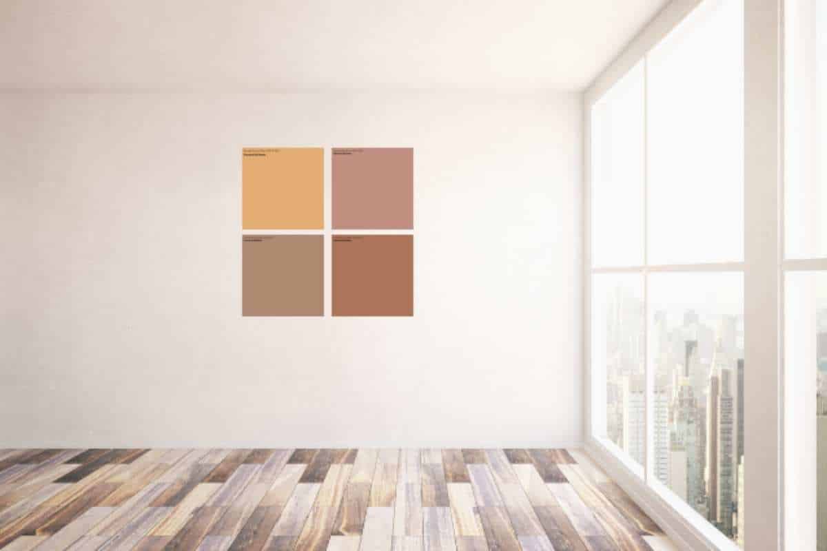
If you’re a fan of color then we’ve also got you covered. These bold and dramatic colors feel timeless and interesting – a difficult combination to achieve. The reason these colors work is because they are pulled from some of the most common favorite colors in the world; blue and green. Most blues and greens will stay in favor because people tend to gravitate towards them naturally. Try these colors on your walls for an ultra dramatic and moody look or create a pop of color by using them on your cabinets. To achieve this rich and luxurious look try Seaworthy SW 7620, Naval SW 6244, or Bunglehouse Blue SW 0048.

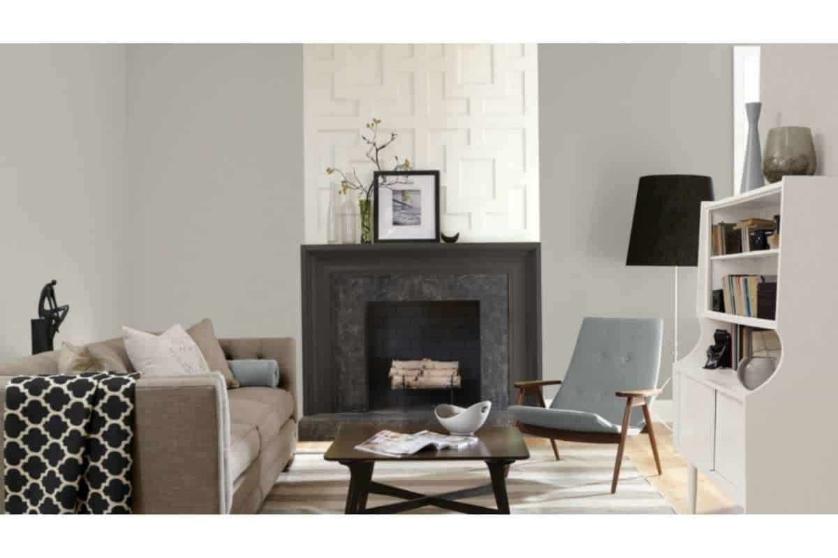
Along with neutrals, grays are a great way to unify a space and keep things simple. Gray has been a very popular paint color for the last decade and it doesn’t appear to be going anywhere soon. We love gray because there are so many options and it can really help create a specific effect within a room. Cooler grays evoke a crisp, clean feeling while warmer grays feel a bit cozier. This dynamic color is great for all spaces especially when a pop of color or textures are incorporated. We absolutely love Passive SW 7064, Silverpointe SW 7653, and Repose Gray SW 7015. These are each light and breezy without being flat and one-dimensional.
If you’re new here, we always recommend that you test out your paint colors before committing. Testing your colors helps ensure you’ve selected an interior color that will support your vision and work with your fixed features and lighting. There are many ways you can test out paint colors so here are a few of our favorites.
Don’t throw away all of those Amazon boxes! Instead, carve them up to create some paint sample boards to test out your paint colors. Simply take a piece of cardboard and paint it with the color you’re considering. Now you can move your board around the room to view it at different angles and under different lighting conditions.
Samplize paved the way for the peel and stick sample and now so many companies are offering these easy options to test your paint colors. These work similarly to the sample boards listed above but with the added benefit of being able to easily stick them to the wall. These drawdowns are generally made with real paint and should give an excellent idea of what the finished product will look like. Sherwin Williams and The Color Shop also offer options for peel and stick samples so be sure to check them out as well.
If it ain’t broke, don’t fix it. You can always go the traditional route and purchase a test quart or two and paint swatches directly onto your wall. We recommend doing 2 ft x 2 ft samples and doing multiple swatches around the room so you can see it under different lighting conditions. Just keep in mind that your paint sample may not be in the correct sheen or exact product you’d use when actually painting and there could be slight variations.
For a comprehensive color consultation with one of our color experts contact us today for more information!