
Call Us Today!
Call Us Today!


It’s time to tackle choosing a paint color with confidence. In order to do just that we’ll need to understand color shades, tones, and how to use a color wheel. Before we begin though, did you read Part 1 of our Kind Color Series? If not, what are you doing? Check out Part 1 right HERE to build your paint color foundation of knowledge! If you’ve already read Part 1 then gold star for you! Part 2 is going to build upon that base and give us all the confidence to choose the perfect paint color for our next home project.
You might remember this one from art class but this is a color wheel. A color wheel can be very helpful when it comes to selecting multiple colors for a project when you want a cohesive feel. There are three ways to utilize a color wheel.
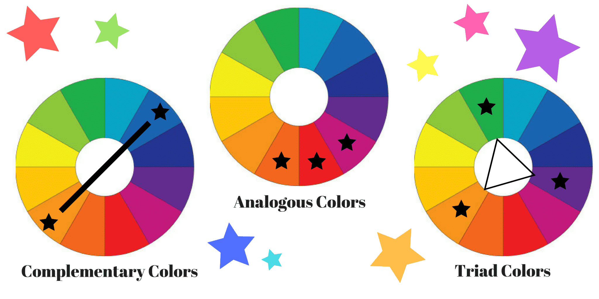
Complementary colors are the colors that are directly opposite from one another on the wheel. Pick any color on the wheel and draw a straight line across the wheel from one color to another. Essentially these colors are “opposites” and they are thought to offset and complete each other. Examples of complementary colors would be green and red, yellow and violet, blue and orange, and so on.
Now, you’re probably looking at the color wheel we’re using here like…I would NEVER use that bright of a red, yellow, etc. in my home. It’s important not to get hung up on the brightness and intensity of the colors here. A color wheel is used to help you figure out which colors pair or contrast with one another. We’ll get into shades and tones shortly.
To find the analogous colors on the color wheel first, select a single color. The analogous colors on the colors on either side of your selected color. For example; if you choose yellow as your main colors then yellow orange and yellow green would be your analogous colors. This is great if you don’t want to venture too far away from your main color but also don’t everything to read as flat.
The final strategy we’ll discuss is the use of triad colors. All you have to do is choose a color on the color wheel and draw an equilateral triangle. You’ll notice that there are three colors aligning with each point of the triangle. These other two colors would be your secondary colors. Let’s take violet as our main color. If we draw the triangle correctly then green and orange should be our secondary colors. This is arguably the most challenging way to utilize the color wheel as working with three different colors can feel a bit overwhelming. Keep in mind, you don’t have to use all of the colors and you pick and choose just how much of each color you want.
Now that you understand a little bit more of how these colors interact with each other we are going to dive into shade, tint, and tone. In other words; color theory. Have you ever described something as purple when someone else sees it as blue? No, we’re not talking about the infamous internet dress. The truth is, we all see and explain color differently. Not to get too technical but this has to do with the light receptors in our eyes that pick up colors being reflected off of a particular surface. This means it’s important to understand tones within each color so you can ensure the end product is what you’re looking for.
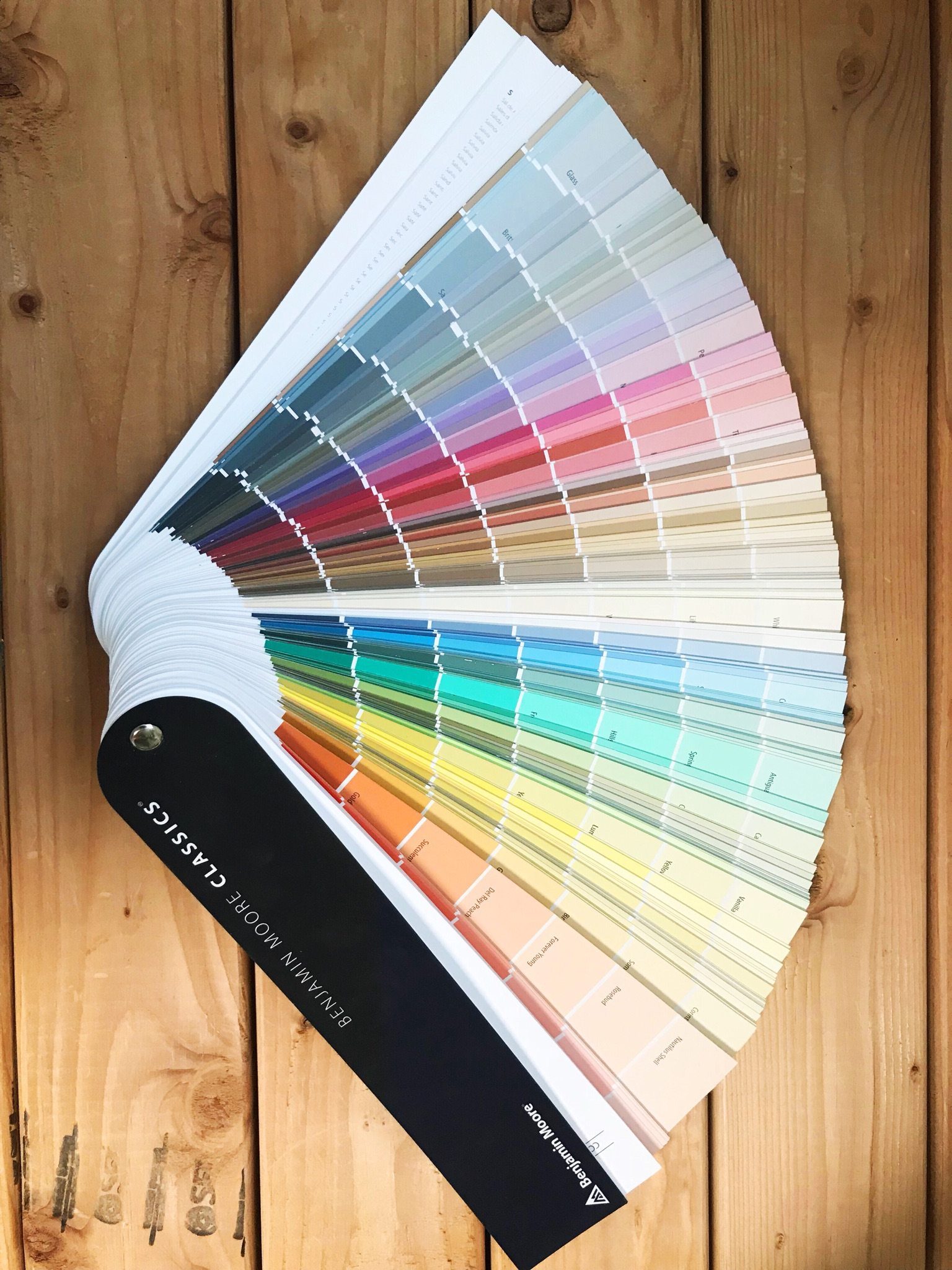
You’ve probably noticed that when you buy paint it may need to be tinted in the store before you can take it home. This is the process of adding pigments to the paint in order to make the color you are looking for. Whenever a color is made by mixing two or more colors together, that color then has both a mass tone as well as an undertone. A mass tone is the initial, dominate color that you see. For example is it a blue, red, green, etc? The undertone is a little more sneaky. If you have an undertone that is close to the mass tone within the color then the truer you
r color will be. For example a true red will have an undertone similar to its mass tone while a magenta will have a blue undertone.
One of the best tips for being able to determine what the undertone of your color might be would be to put it against pure white. You don’t want to look at the color in isolation. Whites and lighter colors can be particularly tricky so another trick is to look at the darker shades on a let-down strip.
An equally important task for selecting the perfect paint color is determining the tone of the color. This is a little more straightforward than mass tone and undertone. Warmer colors will typically have yellow, orange, and red undertones while cooler colors will have green, blue, and violet undertones. Color temperature can have a big effect on the mood of a room so we’ll be sure to dig into each color individually in Part 3: The Psychology of Color.
So, what now? Now it’s time to play around with the color and begin thinking about the feeling you want your space to have. You can use colors to create contrast or to emphasize certain features. It’s really all about your personality and what you’re looking for. To create more of a bold statement you might choose colors all within the same tone; warm tones for example. If you’re just getting started trying to design a room though we recommend leaning towards creating a balance. If you have a lot of warm features in your space you may want to create some contrast with some cooler tones.
There is more to paint color than one might think! That is why the team here at Kind Home Solutions is here to help. We hope part 2 of our paint color series has been helpful. If you’d like to read more about paint colors, please continue reading in our color series part 3, where we cover the psychology of color and how it can affect the look and feel of your house.